GitHub Visualization: Visualization of GitHub's User Activity
About
GitHub is one of the most popular sites for online code repositories. With a large user base GitHub generates lot of activity. This activity, in the form of commits, contains the relations between repositories and contributors. With the use of appropriate visualization techniques we can effectively map the relation between projects and contributors onto visual graphs. These graphs can reveal some interesting trends and insights that are not apparent using text and tables. This has motivated us to create visualizations using commit activity on public repositories of GitHub.
Existing Visualizations
GitHub itself has some interesting graphs that map the activity occurring on each repository. Most of these graphs, however, are standalone and provide limited context. Except the contributor view, there is a lack of concurrent views. This limits the usefulness of these graphs. We decided to address these issues by interconnecting all graphs and concurrently updating them based on user interactions. This will allow us to maintain flow consistency and also provides more information to the user.
Design
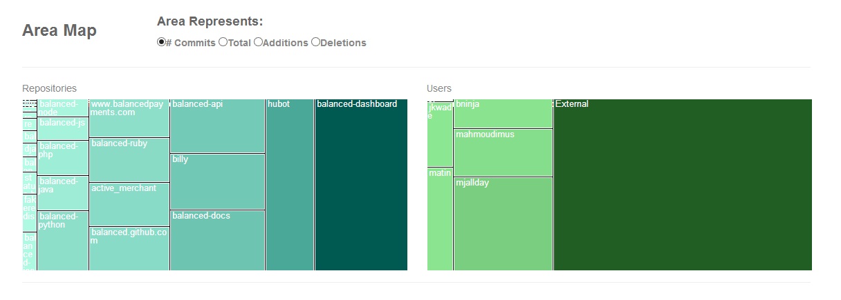
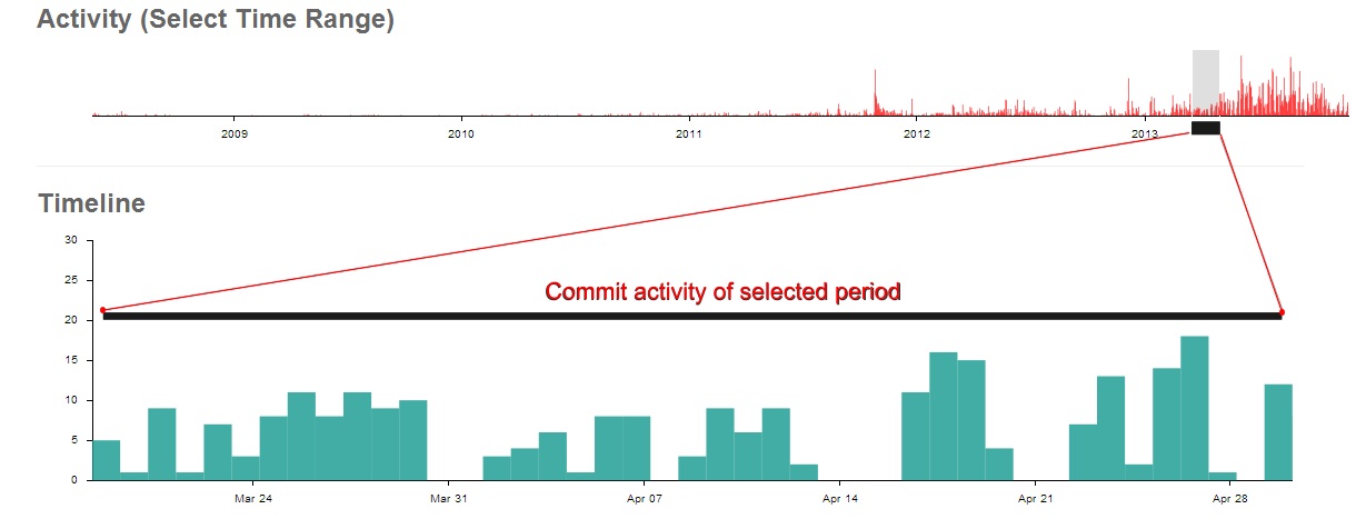
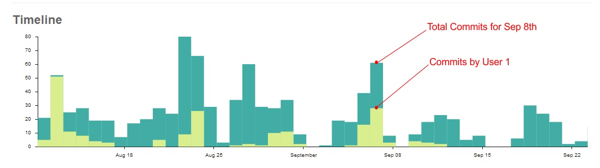
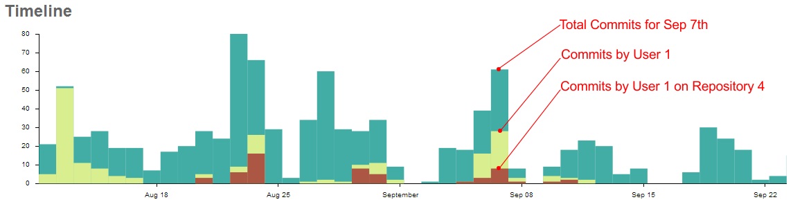
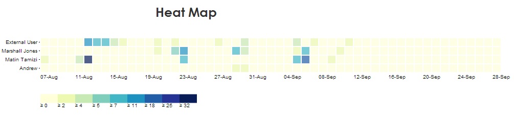
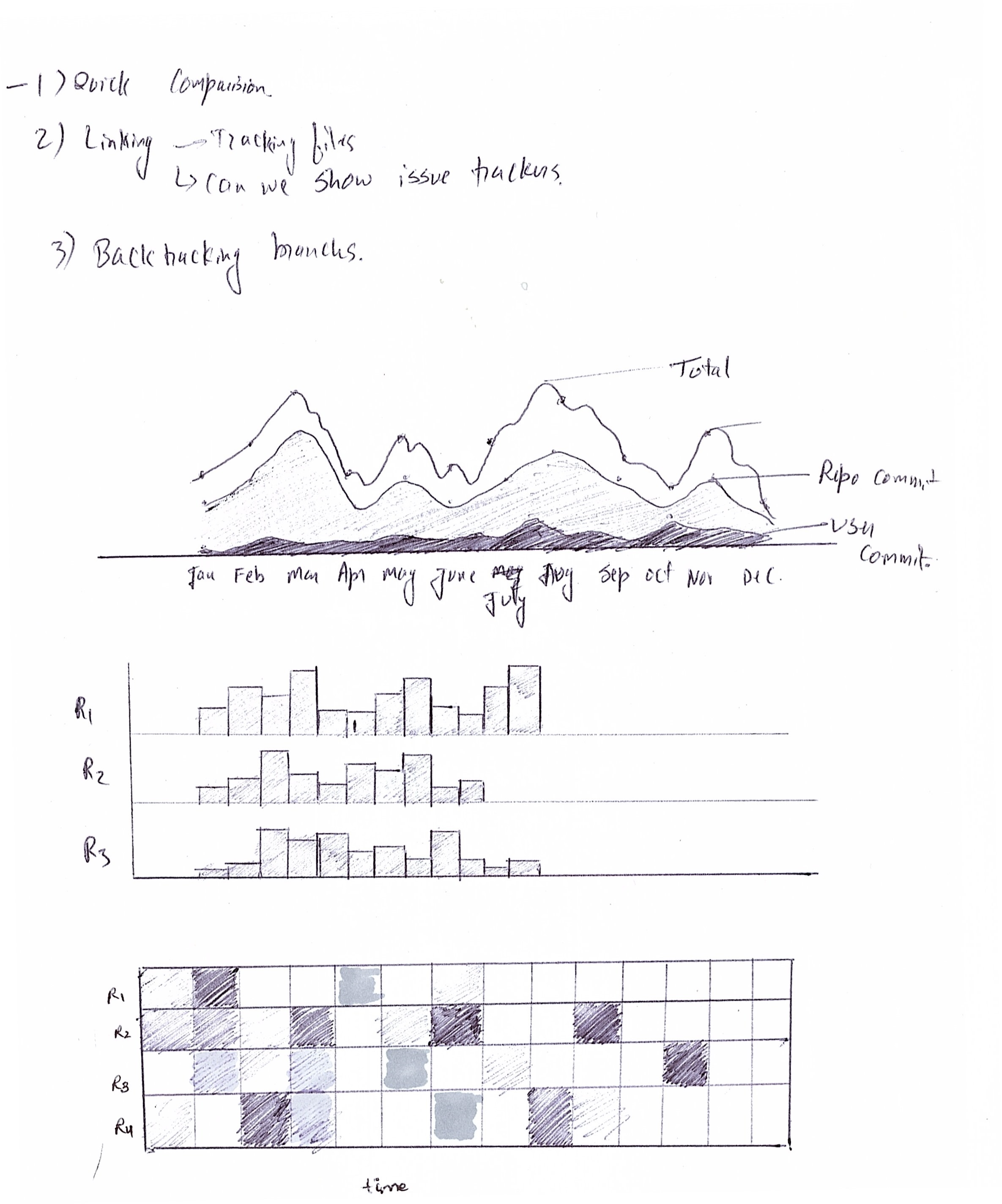
The data generated on GitHub is essentially temporal in nature. However, we also wanted to provide aggregate information in a single view. For this we chose tree-maps that effectively incorporate the data on a single page. The relation between users and repositories was mapped using overlapping bar-charts. Finally a heat map was used to provide detailed activity of each contributor.
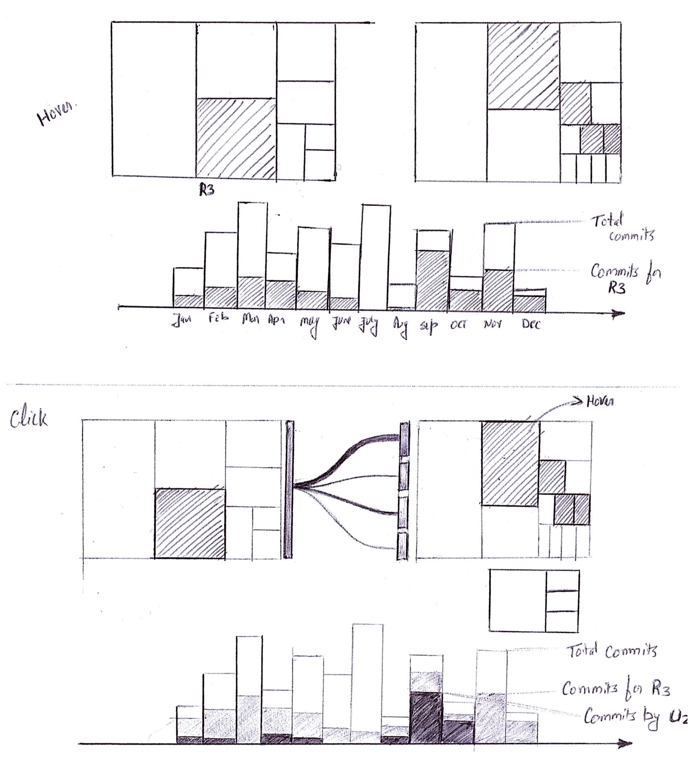
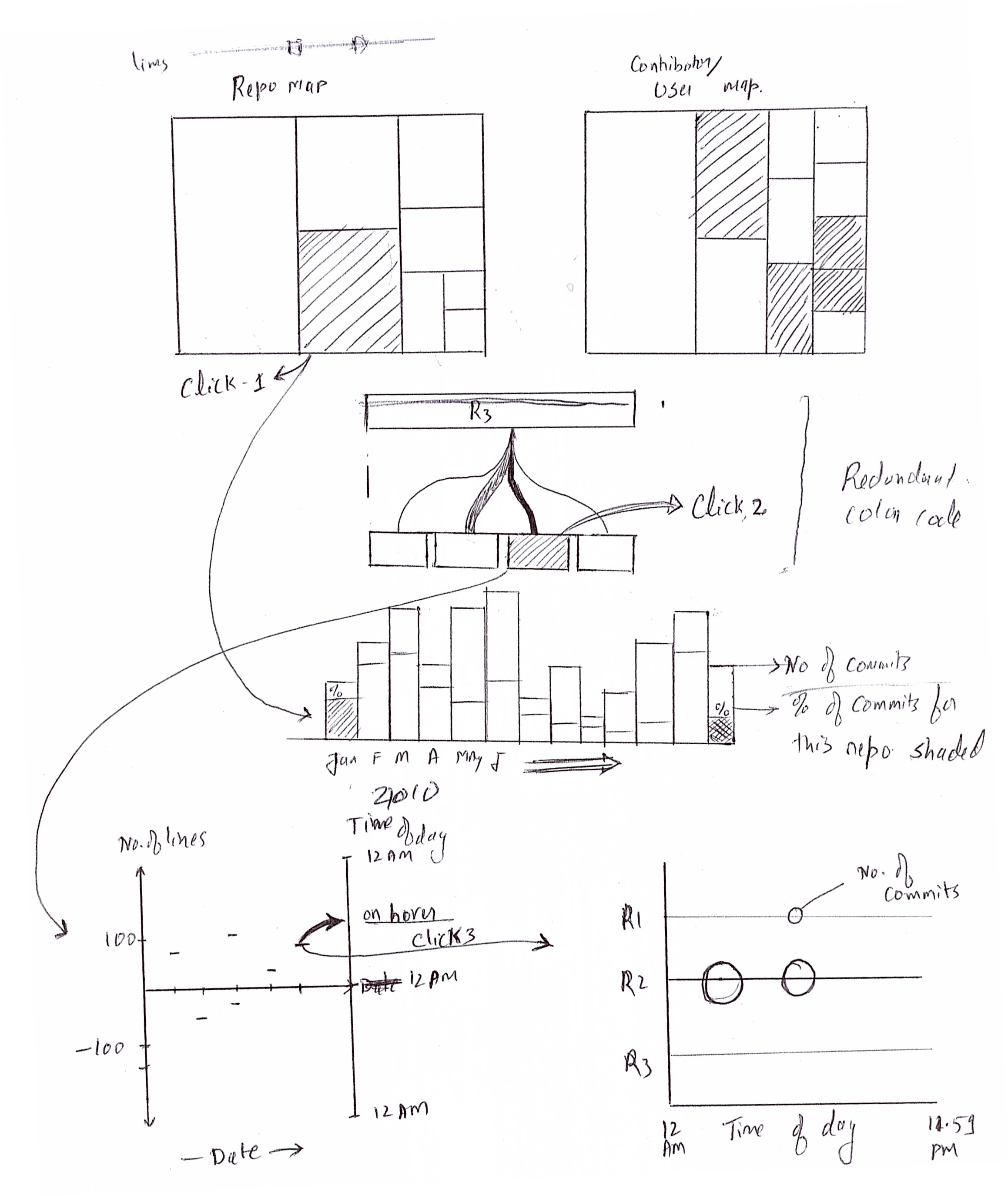
Ideation and Sketches
After going through few design iterations we finalized upon few graphs for evaluation.
Application
The visualization system is implemented using D3.js. The data used is from public repositories of company 'Balanced' on GitHub.
Check out the application at: GitHub Visualization
Screens